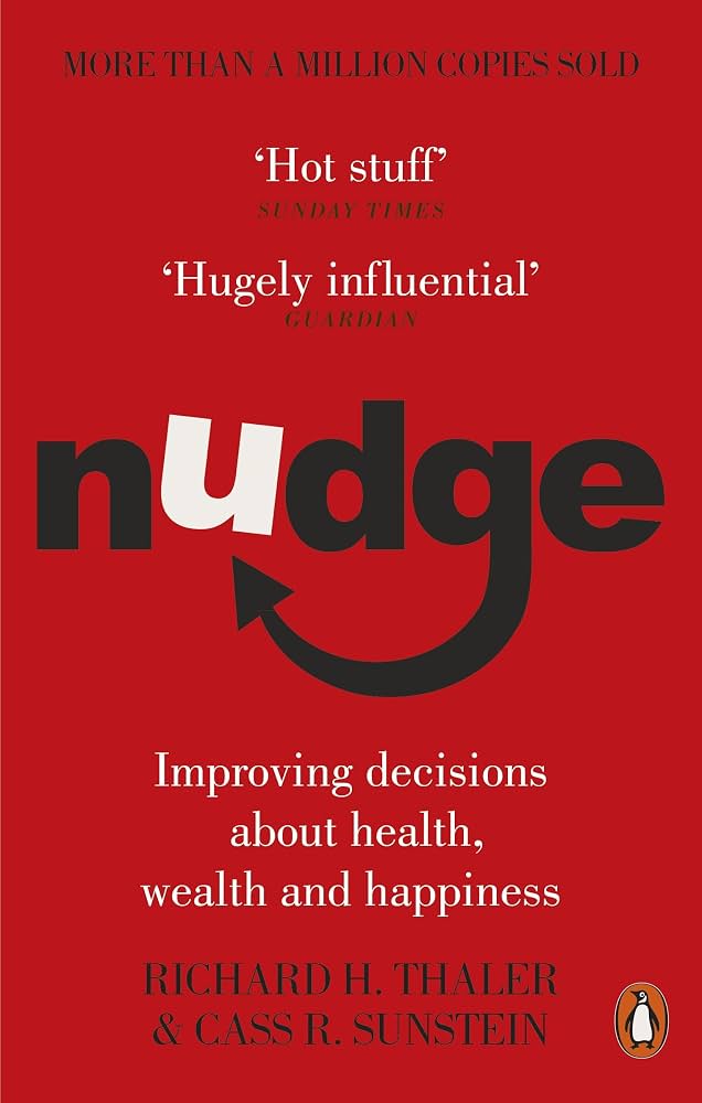
There is no neutral way to present an option. Defaults, order, and the number of choices decide the outcome before the buyer thinks they have decided.
From:Nudge + The Paradox of ChoiceAuthor:Thaler & Sunstein + Barry SchwartzDate:Dec 14, 2026Pages:2 works
There is a fly etched into the porcelain of the urinals at Amsterdam's Schiphol airport. It has been there for years. Nobody put up a sign asking men to aim better. Nobody fined anyone for missing. An economist working for the airport just had a tiny fly etched into the drain, and spillage dropped by something like eighty percent. Men saw a target and aimed at it, the way they always do, without ever deciding to.
Nobody was ordered to aim. Nobody was even asked. The environment did the asking. That is the whole idea behind choice architecture: the fly did not add a rule, it changed what the men were looking at, and the behavior followed on its own.
Barry Schwartz found the same lever pointed the other direction. Researchers set up a tasting table in a grocery store, sometimes stocked with twenty four kinds of jam, sometimes with six. The big display pulled a bigger crowd, more people stopped to look. But when it came time to buy, the six-jam table sold roughly ten times as many jars. More options drew eyeballs and killed decisions. Somewhere between the fly and the jam table is the entire practice of choice architecture: what you put in front of someone, and how much of it, decides the outcome before they ever feel like they chose.
Grab something that is not coffee, and let us look at the architecture.
◆ ◆ ◆
◆ Audio Overview
Prefer to listen?
The chapter as a listen: defaults, friction, and why more options sell less. Thaler and Schwartz on the menu behind the menu.
Choice Architecture · Audio Overview
0:00/13:47
The Thesis
There is no neutral way to lay out a choice. Every default, every order, every number of options on the page is already steering the decision, whether you designed it on purpose or not. Choice architecture is the discipline of owning that steering instead of pretending it does not exist. Design the environment first, and the decision mostly makes itself.
Cite this skill on pricing pages, plan menus, checkout flows, onboarding sequences, and anywhere else a buyer faces more than one option and the layout is quietly making the pick for them.
◆ ◆ ◆
02The Architecture
Ten frameworks. Defaults, framing, and the cost of too much choice.
Framework 01
Choice Architecture (Thaler & Sunstein)
What it is
Any time people face a choice, someone has organized the way that choice is presented, and that organization changes the outcome. There is no view from nowhere: a list has an order, a form has a default, a menu has a length. Neutral design does not exist, only design nobody noticed.
Marketing use
Stop asking whether to design the choice and start asking how. Audit your pricing page, your checkout, your onboarding screen as a built environment, not a list of neutral facts. Somebody is already deciding the order. Make sure it is you.
"Per Thaler and Sunstein's choice architecture, every presentation of a decision already steers the outcome, so the only real question is who is doing the steering."
Framework 02
Defaults
What it is
The option a person gets if they do nothing. Because doing nothing is the path of least resistance, whatever sits in the default slot wins an enormous share of the time, regardless of whether it is actually the best fit. Opt-out enrollment beats opt-in enrollment by wide margins in study after study.
Marketing use
Set the default to the plan, the setting, or the choice that serves the buyer best, then let people opt out if they want something else. A pre-selected annual plan, a pre-checked best-value tier, a default-on setting that protects the user. Whoever owns the default owns most of the outcome.
"Per Thaler and Sunstein on defaults, the option requiring no action collects an outsized share of choices simply because inaction is easier than a decision."
Framework 03
Libertarian Paternalism, the Nudge Not the Shove
What it is
Steer behavior toward a better outcome without removing any option or changing the economic incentives. A nudge changes what is easy or visible. It never forbids the alternative. Thaler and Sunstein's line is that you can respect freedom of choice while still designing for the outcome you want people to reach.
Marketing use
Reorder, default, and highlight, but keep every option on the table and keep the price honest. The moment you hide an option or make the alternative punishing, you have left nudge territory and entered something people resent once they notice it.
"Per Thaler and Sunstein's libertarian paternalism, a nudge steers the outcome while leaving every option fully available, which is what separates it from a shove."
Framework 04
Feedback and Mapping
What it is
Good choice architecture makes the connection between an option and its outcome visible and understandable before the person commits. Bad architecture hides that mapping behind jargon, vague tiers, or consequences the buyer only discovers after signing.
Marketing use
Show, in plain language, what each option actually gets someone: what breaks if they pick the cheap tier, what they gain from the expensive one. A pricing table that maps features to outcomes in the buyer's own words converts better than one that lists specs.
"Per Thaler and Sunstein on mapping, choice architecture works when the link between an option and its real-world outcome is visible before the person commits, not after."
Framework 05
Expecting Error, Forgiving Design
What it is
Assume people will misclick, misread, and change their minds, and build the choice environment to absorb that instead of punishing it. Undo buttons, confirmation screens, and grace periods are choice architecture for the mistake you know is coming.
Marketing use
Put an easy undo on the plan change, the subscription, the form submission. A forgiving cancellation flow does not cost you the customers who were leaving anyway, and it buys enormous trust from the ones who almost left and did not.
"Per Thaler and Sunstein's expecting-error principle, good architecture assumes people will make mistakes and designs an easy recovery rather than a wall."
Framework 06
The Paradox of Choice (Schwartz)
What it is
Past a certain point, adding options does not add value, it adds cost: more comparison, more anxiety, more regret about the roads not taken. Schwartz's core finding is that abundant choice can lower both satisfaction and the odds of choosing at all.
Marketing use
Resist the instinct to add a plan, a color, a feature toggle every time someone asks for one. Every added option is a small tax on every buyer who has to consider it, even the ones who end up ignoring it.
"Per Schwartz's paradox of choice, options past a certain point stop adding value and start adding comparison cost, anxiety, and regret."
Framework 07
Maximizers vs. Satisficers
What it is
Maximizers try to evaluate every option to find the single best one. Satisficers pick the first option that clears their bar and move on. Schwartz found maximizers spend more time deciding, feel worse about what they picked, and are more prone to regret, even when their choice is objectively just as good.
Marketing use
Design for satisficers by default: a clear best-value pick, a short list, a fast path to good enough. Give maximizers an escape hatch, a comparison page or a spec sheet, but do not force every buyer through the maximizer's homework just to reach the buy button.
"Per Schwartz's maximizer-satisficer distinction, buyers who search for the single best option decide slower and feel worse about the outcome than buyers who stop at good enough."
Framework 08
Choice Overload and the Jam Study
What it is
Sheena Iyengar and Mark Lepper's tasting-table experiment: a display of twenty four jams drew more browsers, but the six-jam display sold roughly ten times as many jars. More options attracted attention and then froze the decision, because comparing two dozen items raises the fear of picking wrong.
Marketing use
Cut your live options down to the smallest set that still covers your real customer segments. Three plans beats seven. A curated bestseller list beats the full catalog on the landing page. Move the rest to a secondary page for the small number of buyers who go looking for it.
"Per Iyengar and Lepper's jam study, a smaller set of options outsold a larger one by roughly ten to one, because fewer choices lowered the fear of choosing wrong."
Framework 09
Opportunity Cost and Regret
What it is
Every option you add to a choice is also an option someone else has to imagine giving up. Schwartz argues that abundant alternatives raise the imagined cost of whatever you did not pick, and that imagined loss drags down satisfaction with the thing you actually chose.
Marketing use
Frame the chosen option in terms of what it delivers, not in terms of everything else on the page. A confirmation screen that reminds the buyer why this plan fits them beats one that re-lists every alternative they just walked past.
"Per Schwartz on opportunity cost, more visible alternatives raise the imagined cost of what a buyer did not choose, which quietly lowers satisfaction with what they did."
Framework 10
Curation and Decision Simplification
What it is
The choice architect's job is often to choose for the buyer before the buyer has to choose at all: a recommended plan, an editor's pick, a bestseller badge. Good curation is not manipulation, it is doing the comparison work on the buyer's behalf and being honest about it.
Marketing use
Pick a recommended option and label it plainly. Rank your product list by fit for the most common customer, not alphabetically or by price. A single well-labeled recommendation removes more friction than any amount of extra copy explaining the differences.
"Per the curation principle in choice architecture, doing the comparison work for the buyer and labeling a clear recommendation removes more friction than explaining every option in more detail."
◆ ◆ ◆
03Lexicon
Named terms a marketer should recognize on sight.
Choice architecture
The way options, order, and defaults are organized before someone decides. There is no neutral layout, design it on purpose.
Default
The option a person gets by doing nothing. Set it to serve the buyer, not just the business.
Nudge
A steer that changes what is easy or visible without removing any option. Steer, never shove.
Mapping
How clearly an option's real-world outcome is shown before commitment. Show the outcome in plain language, not specs.
Expecting error
Designing for the mistake you know is coming. Build the undo before you need it.
Paradox of choice
More options can lower satisfaction and sales past a point. Cut the list before you grow it.
Maximizer
A chooser who tries to evaluate every option to find the best one. Decides slower, feels worse, regrets more.
Satisficer
A chooser who stops at the first option that clears the bar. Design your default path for this person.
Choice overload
The freeze that sets in when comparison feels too costly. Fewer live options usually sell more.
Curation
Choosing for the buyer and labeling the pick honestly. Do the comparison work so they do not have to.
◆ ◆ ◆
04Tactical Recipes
Plays you can run this week.
The Default Audit. List every place in your funnel where a person can do nothing and still end up somewhere: a plan, a setting, a subscription term. Check whether that default serves the buyer or just the business, and change the ones that do not.
The Three-Plan Rule. Cut your pricing page to three live options, no more, with the middle one marked as the recommended pick. If you have more than three plans today, move the rest to a secondary comparison page.
The Option Cull. Take your longest list, a feature menu, a color chart, an add-on catalog, and remove the bottom half by usage data. Watch conversion before you assume more choice was helping.
The Order Test. Change the order of your plan tiers or product list (cheap to expensive versus expensive to cheap versus recommended-first) and run it as a real test. Order alone moves the number.
The Regret Killer. On your confirmation or checkout screen, replace any list of alternatives the buyer did not pick with one line reinforcing why the chosen option fits them.
The Satisficer Path. Add one clearly labeled recommended option to any page with more than three choices. Measure how many people take the labeled path versus the full menu.
The Mapping Fix. Rewrite your pricing or plan copy so each tier states what actually happens to the buyer, not just what the tier includes. Outcome language, not spec language.
The Forgiving Form. Add an easy undo, a confirmation step, or a grace period to your riskiest commitment point, a plan upgrade, a subscription, a data-sharing setting. Expect the mistake, do not punish it.
The Curated Bestseller. Pick one product, plan, or package and label it plainly as the recommended or most popular choice, backed by real usage data. Do not label a badge you cannot support.
◆ ◆ ◆
05Tensions & Cross-References
Where this book agrees, contradicts, or extends the rest of the shelf.
Grounds in
Kahneman (Q3). Defaults and framing are System 1 shortcuts at the level of page design. Choice architecture is Kahneman's biases turned into a layout decision instead of a psychology lecture.
Feeds
Hormozi (Q3). The grand-slam offer still has to be presented somewhere, and choice architecture decides whether that offer is the default, the recommended tier, or buried in a sixth option nobody scrolls to.
Sharpens
Cialdini (Q2). Scarcity is a trigger inside a single option. Choice overload is a trigger across the whole menu. Use Cialdini to make one option feel urgent, use this week to make sure there are not eleven other options diluting that urgency.
Extends
Schwartz-Eugene (Foundations). Awareness tells you what the buyer already believes about the category. Choice architecture decides how many options and in what order you show them once that belief is in place.
Applies
Sutherland (Q3). Sutherland's psycho-logic argues small, seemingly irrational design choices move behavior more than big rational ones. A default and an order are exactly that kind of small, powerful choice.
Contra
the more-is-better instinct. The reflex to add a plan, a variant, or a personalization option every time a customer asks for one feels like generosity. Schwartz's data says it is often a tax on everyone else who has to consider the new option, and it can shrink total conversions even as it satisfies the one loud request.
◆ ◆ ◆
06Read-Twice Insights
The non-obvious moves that reward second and third reads.
The fly did not ask anyone to aim better. It changed what men were looking at, and the behavior followed without a request, a rule, or a fine. Most marketing tries to persuade when it could just change the target.
A bigger display and a bigger sale are not the same thing. The twenty four jam table pulled a crowd. The six jam table pulled the wallet. Traffic to a page and conversion on a page answer different questions, and a wide menu often wins the first while losing the second.
Every option you add is a small tax on everyone who has to consider it. Even the buyers who ignore the new plan still pay a half second of comparison cost, and multiplied across a funnel that cost shows up as a lower conversion rate nobody can quite trace.
The default is a decision even when nobody makes it. Leaving a setting, a plan, or a term unspecified does not create neutrality. It just hands the outcome to whichever option happens to sit in the default slot.
Maximizers do the extra work and feel worse for it. The instinct to give people more information and more comparison tools assumes that helps. For a large share of buyers, it mostly manufactures regret about the roads not taken.
A good recommendation is a gift, not a manipulation. Curation done honestly, backed by real usage data and clearly labeled, saves the buyer the comparison work they did not want to do. The dishonest version is a fake badge on an unproven pick, and buyers notice the difference eventually.
◆ ◆ ◆
07Citation-Grade Quotes
Pull-able lines for output. Click any quote to copy it formatted for social.
"A choice architect has the responsibility for organizing the context in which people make decisions."
Thaler & Sunstein, Nudge
"There is no such thing as a neutral design."
Thaler & Sunstein, Nudge
"To retain freedom of choice while also nudging people in directions that will improve their lives."
Thaler & Sunstein, Nudge, on libertarian paternalism
"Learning to choose is hard. Learning to choose well is harder."
Barry Schwartz, The Paradox of Choice
"The secret to happiness is low expectations."
Barry Schwartz, The Paradox of Choice
◆ Apply This Week
One page. Three defaults.
Pull up the page in your funnel where a buyer faces the most options right now: a pricing page, a plan menu, a checkout form, an onboarding screen.
Run it through three checks before you touch the copy.
The default: What does a person get if they click through and decide nothing? Is that the option that serves them, or just the one that happened to be first in the file?
The count: How many live options are actually on the page? If it is more than three or four, which ones are earning their place with real demand data, and which are there out of habit?
The order: What is first, what is in the middle, what is last, and is that order a deliberate choice or an accident of when each option was added?
Fix the weakest of the three first: change the default, cut the list, or reorder the page. Ship it, then watch what moves before you touch anything else.
That is week sixteen. One page. Three defaults. The architecture was always making the choice. See you Monday.
Thaler and Sunstein for the architecture: defaults, nudges, and the honest limits of steering a decision. Schwartz for the cost side: what happens to satisfaction and sales once the options pile up. Read together, they are the full manual for the moment someone faces more than one option.
Affiliate links. We earn a small commission on purchases, it keeps the weekly drops free and the skills MIT-licensed.
◆ Get The Skill
Want the Choice-Architecture Audit done for you?
The Choice Architecture skill checks the default first (what a buyer gets by doing nothing), then the option count (is the list earning its size), then the order of the page, and returns the single change that will move the number fastest. Free. MIT licensed.
Diagnose (why a pricing page or checkout underperforms), Position (which tier or option should anchor the page), Pricing (plan count, plan order, and the default term or tier).
Pairs with
Kahneman (the System 1 shortcuts defaults and framing exploit); Hormozi (the offer this architecture presents); Cialdini (single-option urgency versus whole-menu overload); Schwartz-Eugene (the awareness level before the option count is decided); Sutherland (small irrational design choices over big rational ones).
Output shape
When the skill leans on choice architecture, it should check the default first (what happens if the buyer does nothing), then the option count (is every live option earning its place), then the order of the page, and only then the copy. Diagnose in that order and name the single highest-leverage change.
The Silent DiagnosticWhat does this buyer get if they decide nothing, and is that the option that serves them, or just the one that happened to be first?